Striped border bug on transformed elements in ≤ Opera 12.02
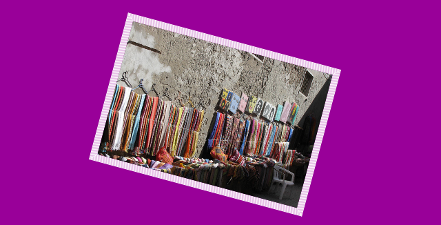

Opera's border rendering on elements with a rotate transform applied.
Opera 12.02 (and older versions with support for transforms) has a rendering bug in which borders of elements that have a rotation transformation applied will appear striped when placed on a colored background. The image above shows this bug in action. The code below shows the markup involved (view an HTML example).
<div id="stripey">
    <img src="essaouira_2.jpg">
</div>
And here's the CSS (using just the -o-prefixed property for simplicity's
sake).
#stripey{
    background:#909;
}

img{
    width: 300px;
    height: 200px;
    -o-transform: rotate(15deg);
    border: 10px solid #fff;
}
Luckily, this is an incredibly easy problem to fix. We just need to set a background color on our transformed object that is the same as our border. Our updated CSS looks like this.
#stripey{
    background:#909;
}

img{
    width: 300px;
    height: 200px;
    -o-transform: rotate(15deg);
    border: 10px solid #fff;
    background-color: #fff; /* fixes the striping. */
}
The result (also available in the HTML version):

This bug is fixed in the Opera 12.10 release candidate. Opera 12.10 should be released soon.