Understanding the CSS Transforms Matrix
This piece was originally published on dev.opera.com, which no longer exists. Some links and images may be broken. Some formatting may be off. You may republish this post under a CC-BY 3.0 license.
- Introduction
- What is a matrix?
- Transforms and coordinate systems
- Calculating the transform: Matrix and vector math
- Compound transforms with the matrix
Introduction
The matrix functions — matrix() and matrix3d() — are two of the more brain-bending things to understand about CSS3 Transforms. In most cases, you’ll use functions such as rotate() and skewY() for ease and clarity’s sake. Behind every transform, though, is an equivalent matrix. It’s helpful to understand a bit about how they work, so let’s take a look.
CSS transforms are rooted in linear algebra and geometry. Though it helps a great deal to have some advanced math under your belt, it’s possible to understand the matrix functions without it. You should, however, be familiar with CSS transforms. If you aren’t read CSS3 transitions and 2D transforms.
In this article, I’ll cover both the 3×3 matrix used for 2D transforms and the 4×4 matrix used for 3D transforms.
Note that as of this publication, Opera does not support three dimensional transforms. I’ve included the 2D matrix() equivalent where applicable.
I’ve also used un-prefixed versions of the transform properties in this article. In practice, these properties are still experimental and subject to change. Include the prefixed versions (-o-transform, for example) in your style sheet until they are finalized.
What is a matrix?
Matrix is a fancy math word for a rectangular array of numbers, symbols, or expressions, (Figure 1). Matrices have many math and science applications. Physicists, for example, used them in the study of quantum mechanics. In the computer graphics realm, they’re also used for things like — surprise! — linear transformations and projecting 3D images onto a 2D screen. That’s precisely what the matrix functions do: matrix() allows us to create linear transformations, while matrix3d() lets us create the illusion of three dimensions in two dimensions using CSS.

We won’t wade too far into the waters of advanced algebra here. You should be familiar with the Cartesian coordinate system. You may also want to review how to multiply matrices and vectors (or use a calculator, such as the one offered by Bluebit.gr).
The big point to understand is that a transform multiplies a matrix by the coordinates of a particular point (or points), expressed as a vector.
Transforms and coordinate systems
First let’s talk about coordinate systems. Every document viewport is a coordinate system. The top-left point in the viewport is the origin, with (0,0) coordinates. Values increase to the right along the X-axis, and down along the Y-axis. The Z-axis determines the perceived distance from the viewer in the case of 3D transforms. Larger values appear to be closer and bigger; smaller values appear smaller and farther away.
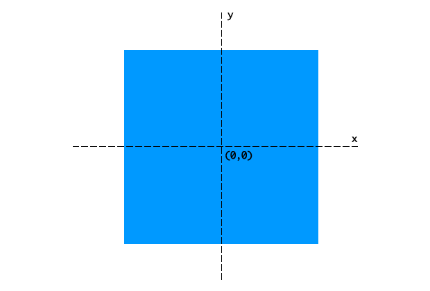
When a transform is applied to an object, it creates a local coordinate system. By default, the origin — the (0,0) point — of the local coordinate system lies at the object’s center or 50% 50% (Figure 2).
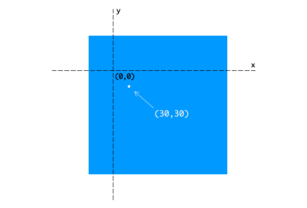
We can change the origin of the local coordinate system by adjusting the transform-origin property (Figure 3). Using transform-origin: 50px 70px, for example, puts the coordinate system origin 50 pixels from the left of the object’s box, and 70 pixels from its top. Transforms for any point within the object’s local coordinate system are relative to this local origin.
Browsers do these calculations for you whenever you apply a transform. You just need to know which arguments can help you achieve your desired effect.
Calculating the transform: Matrix and vector math
Let’s look at an example using the 3×3 matrix used to calculate two dimensional transforms (Figure 4). The 4×4 matrix used for 3D transforms works the same way, with additional numbers for the additional z-axis.

We can also write this as transform: matrix(a,b,c,d,e,f), where a through f are numbers, determined by the kind of transform we wish to apply. Matrices are recipes of sorts for applying transforms. This will make more sense in a bit wen we look at some examples.
When we apply a 2D transform, the browser multiplies the matrix by a vector: [x, y, 1]. The values of x and y are the coordinates of a particular point within the local coordinate space.
To determine the transformed coordinates, we multiply each entity in each row of the matrix by its corresponding row in the vector. Then we add the products (Figure 5).

I know that looks like a bunch of meaningless numbers and letters. But as mentioned above, each type of transform has its own matrix. Figure 6 shows the matrix for a translation transformation.

The values tx and ty are the values by which the origin should be translated. We can also represent it using the vector [1 0 0 1 tx ty]. This vector serves as the arguments for the matrix() function as shown below.
  #mydiv{
    transform: matrix(1, 0, 0, 1, tx, ty);
}
Let’s transform an object that has its top-left corner aligned with the top-left corner of our viewport (Figure 7). Its global coordinates are (0,0).
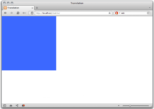
We’ll translate this object by 150 pixels along the X and Y axes, using the default transform origin. What follows is the CSS for this transform.
#mydiv {
      transform: matrix(1, 0, 0, 1, 150, 150);
    }
This, by the way, is the equivalent of transform: translate(150px,150px). Let’s calculate the result of this transform for a point at (220px,220px) (Figure 8).

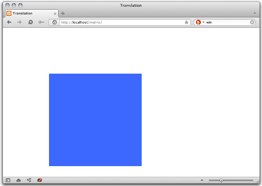
Transforms map coordinates and lengths from the object’s local coordinate system to the previous coordinate system. Where a point is rendered in the viewport depends on the transform applied offset from the object’s start position. In this example, our point at (220px,220px) is now rendered at (370px,370px). Other coordinates within our object’s bounds have also been shifted by 150 pixels to the right, and 150 pixels down (Figure 9).
The translation matrix is a special case. It is both additive and multiplicative. A simpler way to solve this is would be to add the translation value to our point’s X and Y coordinate values.
Calculating a three-dimensional transform
We covered the 3×3 translation matrix above. Let’s try another example using the 4×4 transformation matrix for scaling (Figure 10).

Here sx, sy, and sz represent the scaling multipliers for each axis. Using the matrix3d function, this would be: transform: matrix3d(sx, 0, 0, 0, 0, sy, 0, 0, 0, 0, sz, 0, 0, 0, 0, 1).
Let’s continue with our object from above. We’re going to scale down along the X and Y axes using the matrix3d() function as shown below.
#mydiv{
  transform: matrix3d(.8, 0, 0, 0, 0, .5, 0, 0, 0, 0, 1, 0, 0, 0, 0, 1);
    }
This is the equivalent of transform: scale3d(0.8, 0.5, 1). Because we are only scaling along the X and Y axes (creating a 2D transform), we could also use transform: matrix(.8, 0, 0, .5, 0, 0) or scale(.8,.5). You can see the effect of this transform in Figure 11.
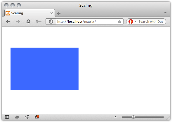
If we multiply this matrix by a coordinate vector [150,150,1], (Figure 12), we get our point’s new coordinates: (120,75,1).

Where to find matrix values
Matrix values for each of the transform functions are outlined in both the Scalable Vector Graphics specification and the CSS Transforms specification.
Compound transforms with the matrix
Finally, let’s look at how to create a compound transform — a transform equal to applying multiple transform functions at the same time. For simplicity’s sake, we’ll stick to two dimensions. That means we will use the 3×3 transform matrix and the matrix() function. With this transform, we will rotate our object by 45° and scale it to 1.5 times its size.
The rotation matrix, expressed as a vector, is [cos(a) sin(a) -sin(a) cos(a) 0 0] where a is an angle. To scale, we need to use the matrix [sx 0 0 sy 0 0]. To combine, multiply the rotation matrix by the scaling matrix as shown in Figure 13 (both the sine and cosine of 45° is 0.7071).

Using CSS, this would be: transform: matrix(1.0606, 1.0606, -1.0606, 1.0606, 0, 1). Figure 14 shows the effect of this transform after it’s applied.
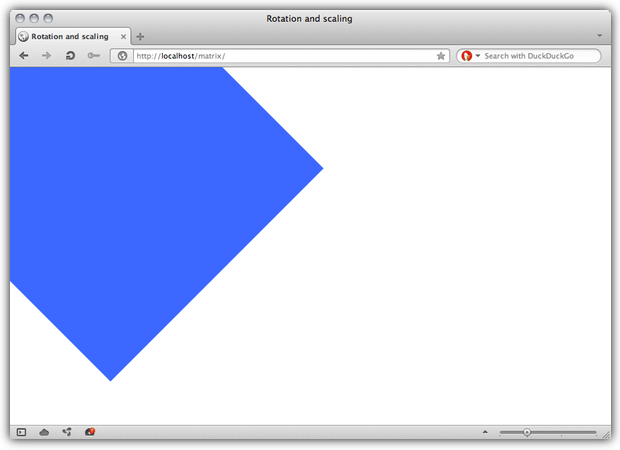
Now let’s calculate the new viewport coordinates of a point at (298,110) as shown in Figure 15.

Our point’s new coordinates are (199.393px,432.725px).
Learn More
I hope this piece has demystified the CSS Transforms matrix functions a bit. If it hasn’t, try consulting the resources below.
- Matrix (mathematics) from Wikipedia
- Understanding the Transformation Matrix in Flash 8 from Senocular
- Transformations from WolframMathWorld